Wednesday, May 27, 2015

the cottage :: kitchen design

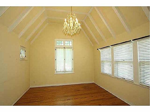
Well way, way back in December I shared a giant overview of our renovation plans for the cottage. It has been just a few short months since then (ha!) and here I am following up my last post with the plan that I put together when we were beginning our kitchen reno in the Fall of 2012. I can't believe that in just a few months it will have been 3 years since we closed on the house and started our renovations. Time really does fly!

The design of the kitchen was pretty easy for me, since I had been thinking and scheming for quite some time before construction actually began. A basic visual overview of the plan is below, but in a few words I essentially wanted it to evoke the cozy, English cottage style that I had in mind for the entire house (it is a Tudor, afterall). I had always wanted classic white cabinets for the space, a deep farmhouse sink (for hiding my dirty dish problem), warm brass and wood, and classic cottage fabrics in more updated colorways. Of course, all keeping with an antiqueish look for the age and style of the home. 

The mood board that I put together when I was in the depths of the planning process really helped to create a visual guide for myself. It makes such a difference to see everything grouped together to help verify choices and get an overall feel of the space. And if anyone is interested in a more detailed post with information on the materials and items selected for the kitchen, let me know and I will put something together.


Now that you have seen the pretty stuff, time for some nitty gritty. We budgeted for this reno based off of the money left over from the sale of my previous home, but we still had to be realistic in our purchases and how we spent our money. I try to be as thrifty as I can be, as does Shaun, so we spent a lot of time researching options and prices to get the biggest bang for our buck. The biggest expense of this project (other than the labor; we hired a contractor instead of DIYing this bad boy) was the cabinetry. Thankfully, at the time we were renovating, my Dad worked for Masco (the company that owns Kraftmaid cabinetry), and we were super lucky to get an immediate family discount on all our cabinets. That, paired with the discounts and extra promos offered by Home Depot (where we made the purchase) helped tremendously on total cost. 

Below you can see the sketch-ups done by the Kitchen Designer at Home Depot once we had nailed down a plan for our space. Our kitchen isn't very big, and we have an odd combination with the little 'breakfast nook' area, so we definitely had to get creative on how to maximize cabinet and counter space while still creating a workable triangle. 


In the sketch above you can see our sink prep area, with dishwasher, and trash/recycle cabinet to the right. I chose the spice drawer cabinet to fit the small leftover space, but we actually use it for cooking utensils like tongs, meat thermometers, peelers, measuring cups, silpats, rolling pins, etc. Pretty much anything long and narrow. The drawers are more efficient than I could have ever imagined!

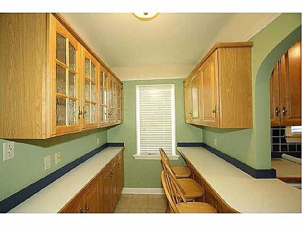
The peninsula shown above was before it was corrected to the right length. It doesn't stick out nearly that far. We had to do something to work around that corner and move back in the 'breakfast nook', so we did a narrow cabinet back down the side by the window, a window seat cabinet with pull out drawers, and then a full cabinet to the side. I chose not to do uppers on this portion of the kitchen, and opted for shelving instead. You will see more on that when I post final kitchen photos further down the road.


This sketch is looking into the main area of the kitchen, with the stove and the built-in 'hutch'. The area for this built-in already existed in the previous kitchen, I just accommodated the space for the new design and used it as an opportunity to put in details like glass front cabinets to give the look of a piece of furniture.


I so wish I could have done a hood above our stove instead of the above-range microwave, but unfortunately we just did not have enough cabinet space to put it anywhere else. We needed all the cabinet space we could get in this very economically sized room!


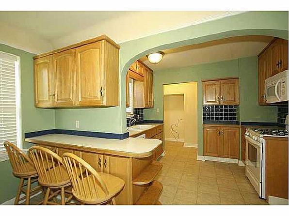
This area above was probably one of the biggest and most exciting changes of the kitchen design. The original kitchen did not have the refrigerator in the physical kitchen space (like many old houses it seems). It sat slightly outside the kitchen in the backdoor area, which is just beyond the doorway shown in the second photo.

Fortunately, we were able to remove an existing small coat closet on the other side of the wall and a strange built in cabinet (with built-in ironing board - in the kitchen??), to accommodate our new recessed refrigerator cabinet and side pantry. It worked out perfectly and made the space finally feel modern and workable!

The only other major part of the renovation not shown in these sketches in the opening up of the wall dividing the above area and the dining room. Originally there was just one doorway into the kitchen from the dining room and this separation made the kitchen feel extremely closed off. By expanding that doorway into a large arched opening to match an existing arched opening between the living and dining rooms, we gained a whole new open flow to our main living areas and increased the natural light in the kitchen tremendously. It was hard to adjust the original footprint of the house, but I still think it was one of the best decisions we could have made.

Next up - demo! 

Tuesday, December 30, 2014

the cottage :: plans

Since I officially introduced you to the inside of our humble little abode a couple of posts back, I figured it was time to fill you in on our renovation plans.
We had a rough plan of attack from the get-go, mostly making sure that we knocked out our biggest project (the kitchen) while we still had time in our temp apartment and could do the work without having to live in the middle of it. This was also a blessing since we had to redo all of the floors, which in my opinion, would be the absolute worst thing to have to do while living in a home.

Here is an initial list of our plans (give or take a bit of course) -

Stage One:

- Gut kitchen/total remodel
- Remove existing areas of carpeting and sand/refinish original hardwoods throughout house
- Paint all interior walls and trim
- Redo flower beds in front yard and do some initial small stage landscaping

Of stage one we have finished the kitchen remodel and only need to do minor little touch-up and tweaks here and there. Yes, it has officially been 2 years and I still have areas to touch-up paint and caulk. Ha! (I was burnt out for quite awhile, people. Forgive me).
We have also finished most all of the painting. Still some trim and doors to do.
Front yard beds are done, and we continue to plant and experiment every spring with what we like and what will live.


Stage Two:

- Gut and redo main full bath
- Makeover 1/2 bath
- Finish any remaning interior painting
- Fix and repaint original front door
- Stain sun porch concrete
- Finish front yard landscaping
- Begin landscaping of backyard
- Small makeover/improvement of basement spare room (gym?)
- Misc. other small piddly projects

Of stage two we are planning to begin the bathroom renovations in the next few weeks. I am currently making plans, sourcing and trying to stay in budget. Always such a downer.


Stage Three:

- The backyard dream (I wish). But hopefully some kind of patio/deck/pergola combo.

This is most likely in the far, far away future after we dump our money in bathrooms. No pun intended.


And now that you have been filled in on our multitude of plans, past and present, I can start the process of catching you up on all the work we have done in the last two years. It seemed like it was so productive and fast paced in the beginning and then things slowed down this past year. Even then, we still managed to knock out quite a few items on our list. First things first, though. I am going to start all the renovation catch-up posts with our biggest project to date; the kitchen.

 Prior to any demo. This was the way it looked when we bought the house. Remodel c. 1993.
Some might ask why we chose to gut and remodel this space. Everyone has different opinions and styles and to quite a few, this might look like a very lovely, cozy, little kitchen. However, to us, it was just not what we had envisioned for our new home, and for many reasons.

Let me preface the rest of this by saying that I am absolute huge proponent of maintaining the character and authenticity of an old home. Anyone who knows me also knows my extreme love of antique homes. It is something that has always been in me. I don't like shiny and new when it comes to houses. The older the better. I also don't like ill-planned, ill-conceptualized, and ill-designed remodels in antique homes that do not look like they belong. But, I do embrace the times we live in and modern conveniences. So, to me, that is the greatest challenge of all. Doing work to a house that still feels period appropriate and that will be a classic, timeless update.

With that, we wanted to update the kitchen and give it classic details that would match the existing character of the home, but also bring it in to modern times. It was in the kitchen that we decided to do the one major structural change to the house, by opening up a small doorway (seen above) from the dining room to the kitchen to bring in additional light and make the space feel more open to the rest of the house.
An open-concept layout is just not how these old houses were designed or used back in 1930, but we just couldn't imagine having a kitchen completely closed off from the other main entertaining areas of the house. We like people to hang out in the kitchen with us when we are having get togethers, so we hoped we could help make the space feel more welcoming while also increasing the natural light by making these changes.
Not only was the current space dark, closed off and unwelcoming, it was also very poorly laid out. The remodel done in the 90s took what was most likely a small breakfast nook and filled it will narrow cabinets and a bar that faced directly into a wall. The 'triangle' was sorta there, with the refrigerator sitting outside the kitchen in a small opening by the back door (see bottom photo). This was most likely the spot where the original 'ice box' would have sat, since at the time the house was built it wouldn't have been designed to accommodate a modern fridge.
The cabinets, although most likely custom at the time, were worn after almost 20 years of daily use and at some point the previous owners had attracted a rodent problem that we only discovered after going in and doing our first cleaning (fact - we never had a problem from the start of our move in, gut and renovation).
We also knew that all these things (and price) were the reason the house (in a well desired neighborhood) had sat on the market for so long, while other houses in the area were flying. If we did the renovations we had in mind well, it would add so much value to the home. So we went for it.

Check back for a post of the kitchen design scheme and what things looked like when we started to tear down walls and get dirty!


Monday, October 27, 2014

the cottage

So, I thought I would step away from shop talk while I work on getting new items listed and tell you a bit about our biggest project, our little cottage that we purchased back in 2012. This was about 6 months before we got engaged and started planning a wedding, which ended up being a great thing because we got the big bulk of our renovations done before I ever started thinking about things like wedding colors and flowers.

It took us a while to find exactly what we were wanting and in our ideal neighborhood. I had a very long list of things that were important to me. Hubs basically is the least demanding, easy going person you will ever meet, so he let me do the searching. Imagine that!

I wanted a home that was built before 1940. Yes, the older, the better. I wanted to make sure as much of the original character had been preserved. Which is surprisingly difficult, since many people have gone into the older homes in Tulsa and done very poor renovations. With that said though, we were looking for something that we could make our own, but a project that was reasonable and not a total overhaul. That is also difficult.

Thankfully, after about a year long process of house hunting, we stumbled upon the perfect little jewel, in our very favorite neighborhood. And although it had a terrible 90s kitchen, and a pretty ugly bathroom, we could see the potential. Plus, it was the perfect little fairytale cottage that I have always dreamed of!

With that little intro, I suppose there is no better way to share the story of life in our new little cottage or to document our current, past and future projects, than to show the first (pre-move in) pictures of our new place. Mind you, these are just the listing photos. I have a few more empty house iPhone pics before we started the reno, which I will share later. But unfortunately the better photos were on my camera, which was stolen from our temp apartment a few weeks after getting the keys to the cottage. That was a rough time, let me tell ya.

So for now, here is the house as it appeared online. Empty, yet full of character, and calling out for someone to give it a new life - just what we intended to do!

exterior (original leaded glass windows!)
exterior/sun porch (dead bushes included)
living room (vaulted ceilings and beams!!)
dining room (more original windows and hardwoods!)
kitchen (oak, oak and more oak)
breakfast nook (enjoy staring at the wall while you eat your cereal)
full bath (that tile is plastic, people)
master bedroom (cool ceilings and whole lotta windows!)
guest bedroom
third bedroom/office
half bath (cutest little mini jack and jill ever)
basement (storage/potential workout room)
basement (I do laundry here. Anyone scared yet?)
sun porch (the best)
backyard (potential)
garage and original maid's quarters
I hope you have enjoyed taking a peek into the way our home looked before we got our hand's on it. It looks so much different these days!

Thursday, October 16, 2014

shop + beginnings

Welcome new friends! So, I started an Etsy shop back in November of 2013 on a whim because, well, I love old things. And I also like finding old things that I think other people will love. Doing the whole Etsy thing seemed like the perfect way to marry my love of vintage (without becoming a full on hoarder) by also helping others find unique items for their home or collection, and so House and History was born.
The shop has just been lingering around as I planned a wedding this past year, got married, went on my honeymoon and then transitioned into married life, all the while working full time as graphic designer. Thankfully, things seem to be slowly starting to get back to a normal pace and I am hoping this will be the perfect opportunity to get House and History going strong.
So, here I am, in this little slice of the internet, setting up a place where I plan to share updates on the shop and the goodies I currently have for sale, as well as upcoming items. You may also find posts about my better half and I, our lives as newlyweds, our little cottage that we have been renovating since we bought it about 6 months before we got engaged, our babies (fur babies that is) and other random happenings. I hope you'll come around for a visit once in awhile and share in this fun new adventure with me!


Visit the shop here